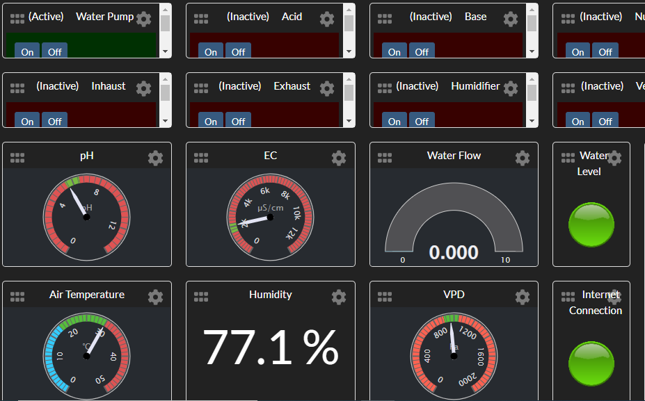
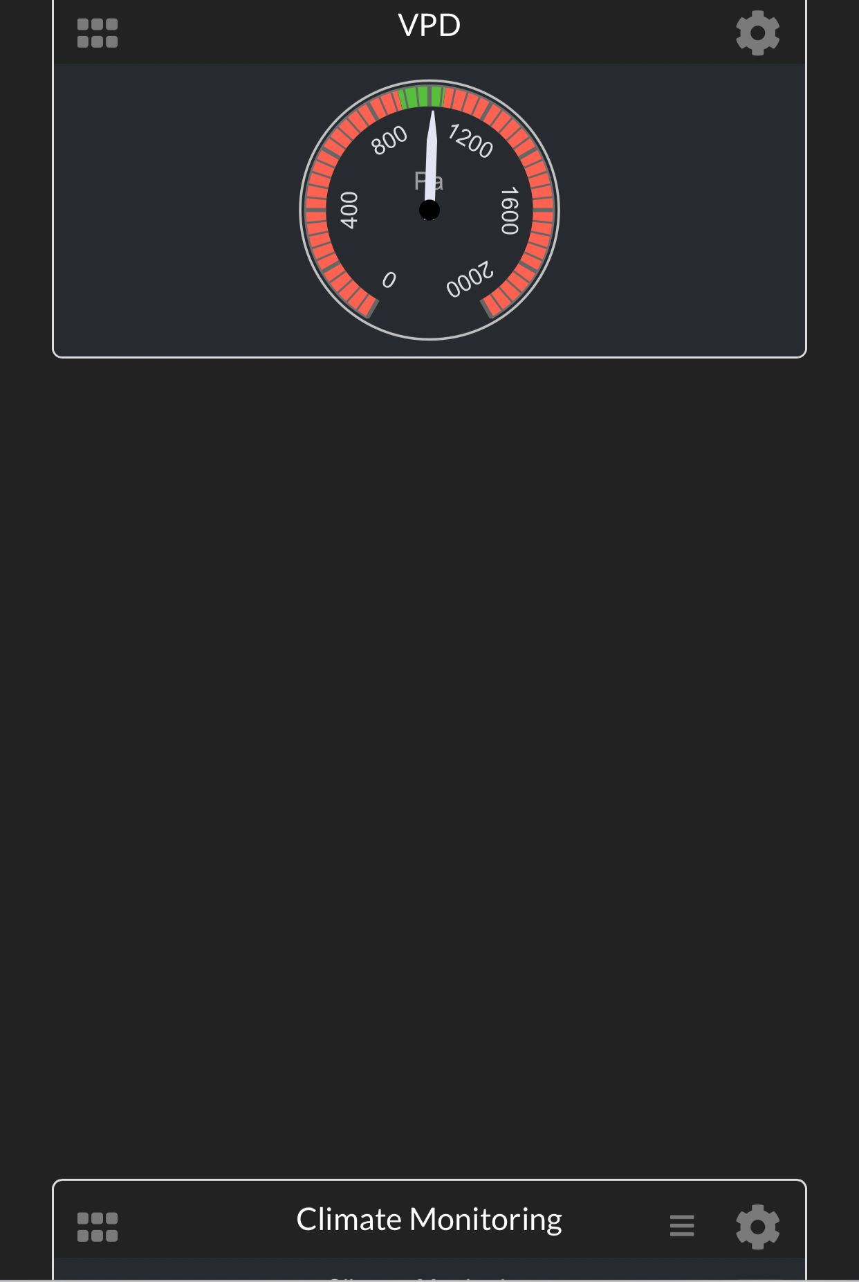
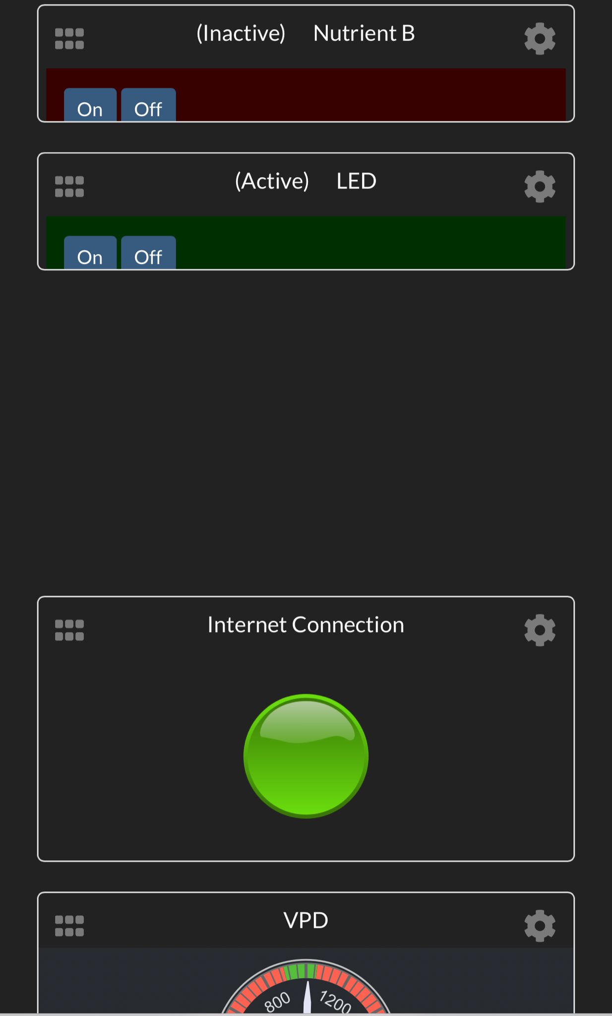
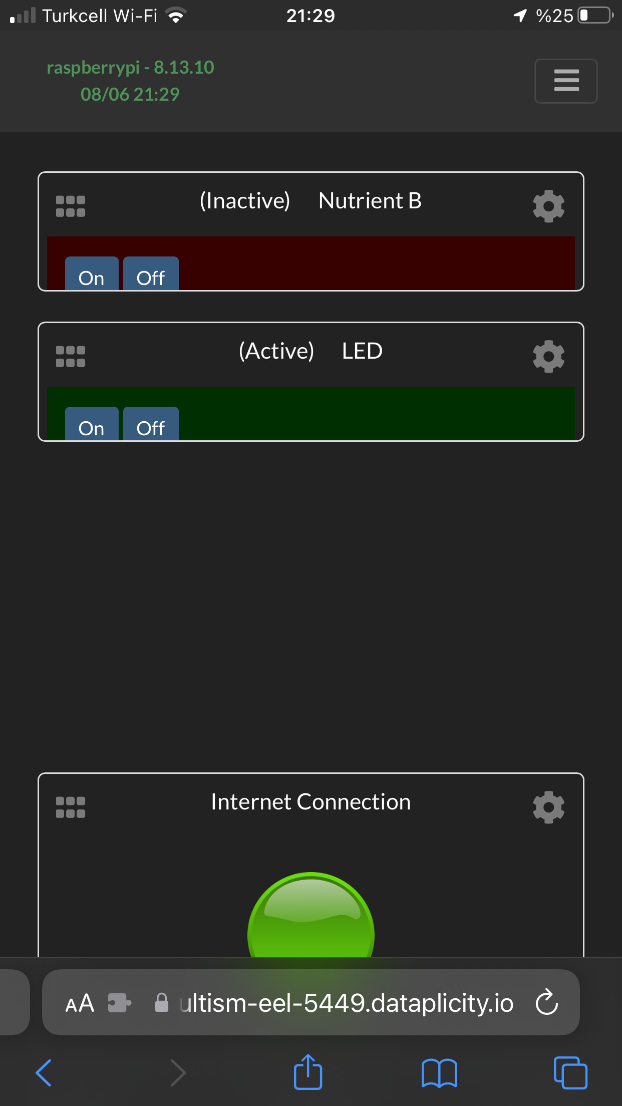
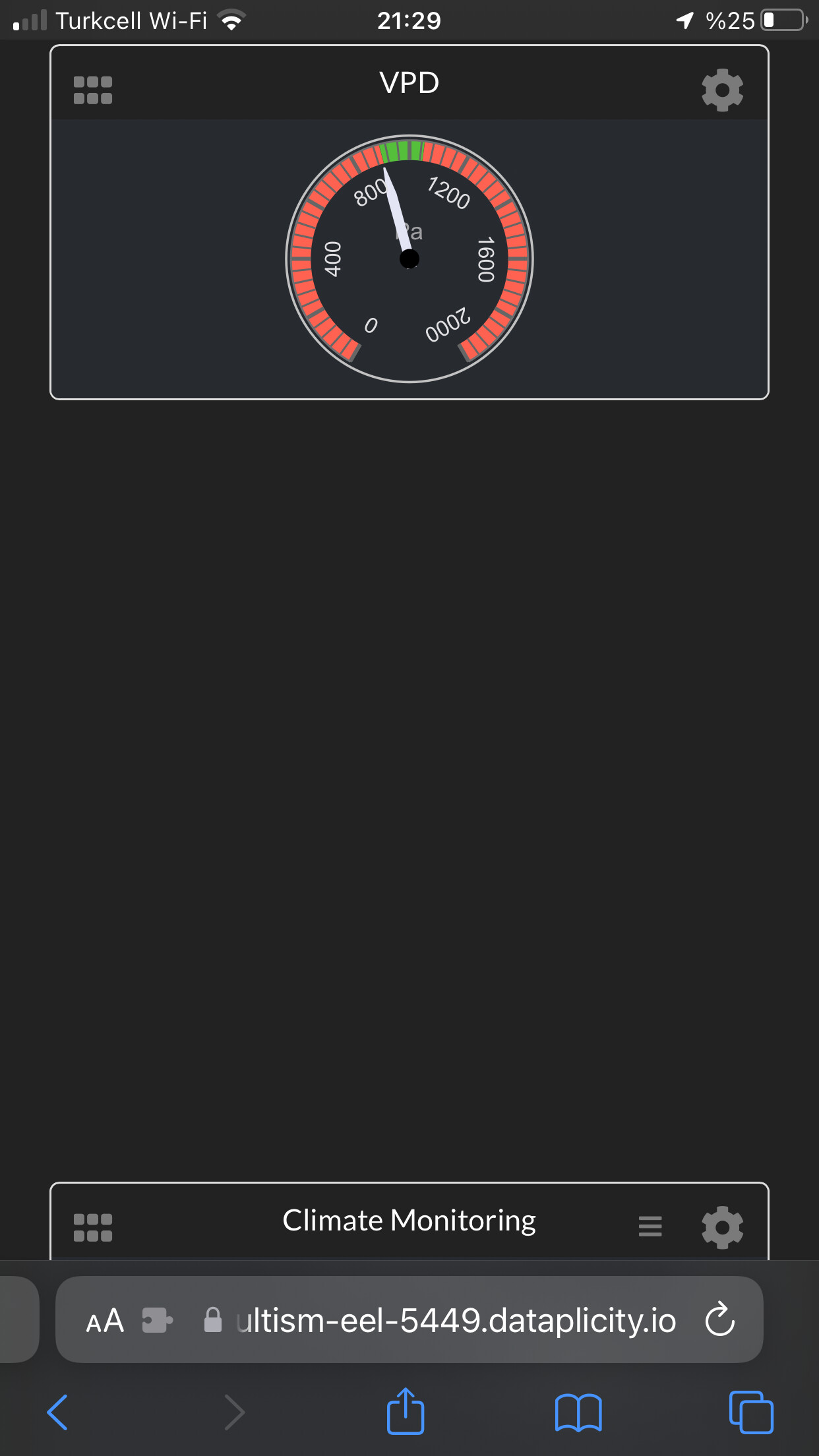
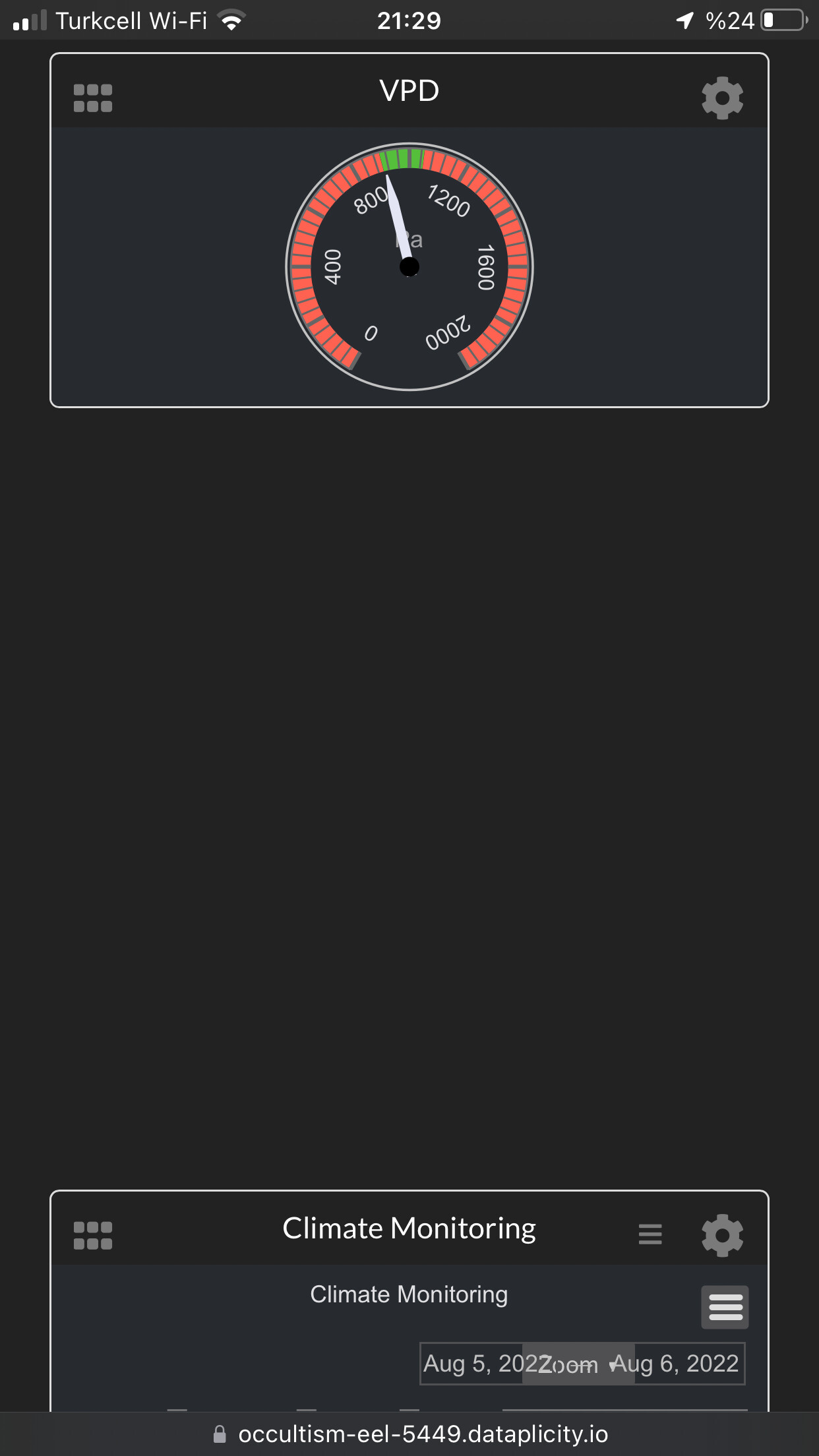
Is it possible to make the dashboard pages responsive for mobile usage? After designing it from a computer, everything’s become mixed up and scattered.
As you can see, the computer view is clean and tidy whereas the mobile view is scattered with no order between the elements. What might I be doing wrong in here?
Thanks. That is strange. I’m not sure what’s causing it. The JS library is gridstack, if you want to investigate what the issue could be. I’d recommend making different dashboards for desktop and mobile views.
I found disabling float allowed the mobile layout to remove the excess space between items, but the layout order is the same. I’ve committed the change of float to the code, since this was originally set true before I made a fix for mobile browsers incorrectly/accidentally resetting layouts for desktop views. This change only fixes the issue of excess space in mobile view, not change the sort behavior. Currently I don’t know how to change that.